Every small business needs a website.
You may think that you don't need anything fancy, as long as you have the basic information displayed on your website. But having an attractive design is important for capturing new customers, keeping the current ones engaged, and boosting your SEO rankings.
Web designing in Pakistan is significantly increasing as businesses understand the importance of having a great website.
A great site will keep visitors coming back by making it easier for them to find just what they’re looking for.
Moreover, with websites becoming increasingly mobile-friendly, businesses must also take into consideration how their site looks on smartphones and tablets.
In its article, we will discuss the 6 principles of a good website design that will keep your business stand distinct from your competitors:
1. Structure
The structure of your website should be simple, neat, and logical. It is best to go with a two-column design for the home page. On other pages, three columns are easy to navigate and give a prominent place to your content!
On the other hand, when you use too many columns, the site appears to be cluttered and hard to read.
But how do you know which layout suits the best to your business?
Simply check out the websites of your competitors, see what they’re doing and what’s working for them before you get on with designing your own website.
2. Visual Hierarchy
Human beings are visual creatures. They will look at the design and structure of your site first, before making any decision on whether to click for more information or simply go elsewhere!
So, make sure that you have a clear plan for how you will present your products or services visually from the home page.
Visual hierarchy is the principle of arranging elements in your design on the basis of their importance. The visual elements that you add on your website, such as the menu icons and CTA buttons should be clear, visually appealing, engaging, and easy-to-understand so that the users are not confused.
These are the four types of hierarchy in terms of web design:
Visual: Colors, fonts styles, size of the font, etc.
Semantic: Information based on what is being displayed on the screen, i.e., name of the page, heading, subheading, etc.
Structural: The screen area dedicated to one item in the hierarchy (size of the text box)
Affordance: How does the design and layout lead the user to click?
3. Color Psychology
Having an appropriate color scheme is imperative when it comes to web designing, especially if you want to convey certain emotions or build a strong brand image.
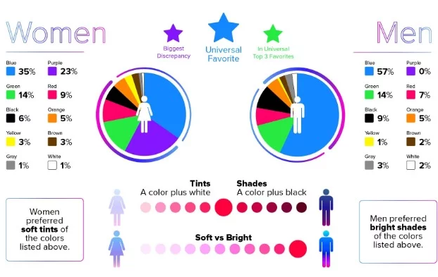
Be it red that represents passion and energy or blue which can make people feel calm, there are just too many colors out there to choose from but having a good understanding of how they affect human emotion will help you find your perfect color scheme for the website!
Did you know it only takes milliseconds for your website visitors to form their view of your business based on the website visuals?
A study from VMG Studios talks about the color preference of men and women and how they perceive a website.

If the color scheme of your web aligns with your audience and services, higher are the chances that you can set your reputation as an authority website.
4. Fonts
Your content is the most important part of your website. It’s your channel of communicating to the potential customers. So, make it stand out by choosing appropriate fonts for headlines and body text.
Moreover, do not use more than two different fonts for your site.
Make sure that your font color and size is easy on the eyes. And also make sure that there is enough space between each letter to make it easier for people to read!
A good business will always promote one font over the others to make it unique and personal! But which font aligns with your business and how will you choose the most appropriate one? That's where most web designing companies in Pakistan help their clients.
5. Content
Apart from doing SEO of your website content, how content appears to your audience is also equally important.
After you have decided on color psychology, structure, and fonts, it is time to focus on the content. If there is one thing you must keep in mind while designing your site, it is that a good design does not make up for bad quality content.
Thinking about what to write and how to organize everything can be tricky. How do you decide where to put images?
A professional web designer in Pakistan will provide comprehensive information according to your business needs like what should go into the navigation bar and where to put the content in order to make it appealing?
6. Navigation
A website's navigation is the backbone of any website and should not be overlooked.
It's important that your website is easy to navigate through for your visitors so that they don’t feel confused or overwhelmed.
When developing a website, there are two ways to organize your navigation:
Vertical scrolling: This method works well for a small number of links (10 or less). To make vertical scrolling work best, use text-only lists with no more than 10 items.
You could also consider numbering your links if you have more than 10 links on a page.
Horizontal: A horizontal menu typically has multiple layers (dropdown) and uses icons to visually represent the name of each link.
7. Website Purpose
Before you start developing your website, you should know the answer to this question:
“What are you trying to achieve?”
Is your website meant for advertising and sales like traditional eCommerce websites or simply informative as in the case of news publications? Do you want to integrate different payment methods and add products on your site or would you be describing your services only?
Defining the purpose will guide the rest of your decisions, including design and functionality.
For instance, if you're creating a website for a technology startup, your purpose is obviously to showcase your products and acquire clients. You’d use different colors, images, and texts on the site than if you were designing an art gallery site.
A website's main focus could be selling products or services, providing information, building credibility/trust, or engaging visitors to join a community.
Pro Tips to Ensure Website Design Success
1. If you need a website design solution in Pakistan or anywhere else in the world, do a thorough search online; see how your competitors' websites look like and what services they offer so that you don't have to end up paying for something you did not ask for!
2. Do competitive analysis; research what similar products or businesses are offering regarding their range of products or services on the internet. This will help you in determining the price range for your website design project!
3. Outsource to an expert if you don't have the expertise or time on hand to do it yourself because they will know exactly how best to handle your project and get you the results you want within a reasonable amount of time!
4. Keep a close eye on trends in web designing; this way you can easily judge whether other websites are providing better services than yours or not. You may later decide to tweak your website design, layout, etc. a bit, if need be, so that it gives people greater pleasure when visiting it!
5. Always hire a professional web development company in Pakistan with good credentials, who can do justice to your project and give you the results you want!
Making a great first impression on a website visitor or even otherwise is something that every individual aspires for when creating an online presence, whether it be through website designing or attractive web layout!
After all, this is what attracts people to explore your site further; which eventually becomes your source of income and helps you to spread your message far and wide.
So, if you want to be spruced up in all manners of the presentation then you need a good web designer!
Having a professional website is one of the most important parts of any business strategy today and it's only logical for you as an entrepreneur to pay special attention to this area because first impressions matter a lot!


